A practice has little room to stand out when its brand feels unclear. We built PraxisMind an identity, logo and responsive website that earn client trust.
Brand Identity & Website
PraxisMind
Project Scope
Brand & Web
Project Duration
2 Months
Project Description
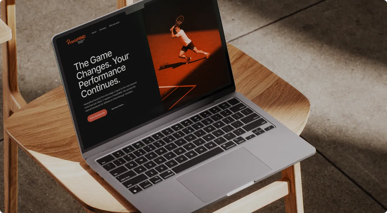
PraxisMind needed a brand people trust and a website that works on every screen, so we built both as one.
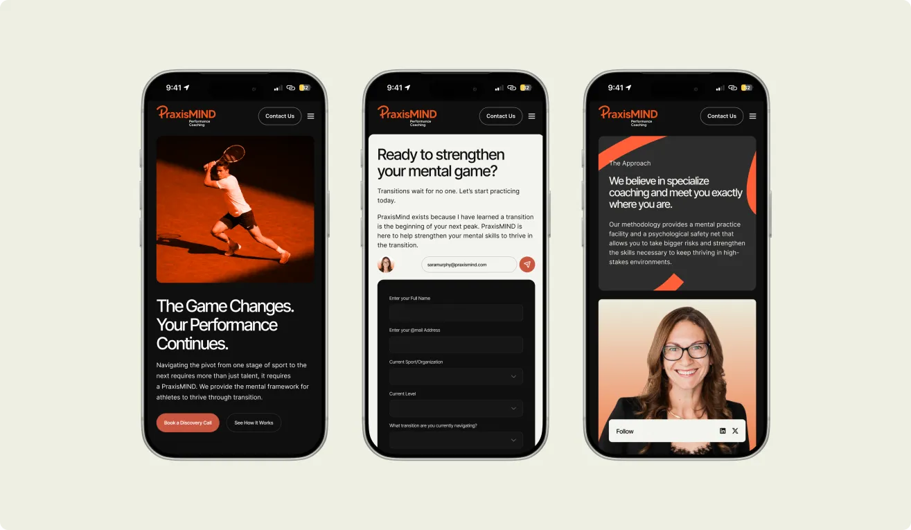
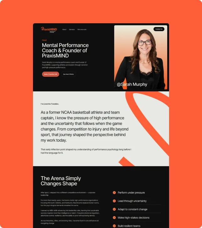
Clients judge a practice fast, often before reading a word. Mismatched visuals and a clumsy mobile site cost trust. We designed the logo, brand guideline and responsive website as one brand.
Problems
The brand had no guidelines, so logos, colours and wording often changed from place to place.
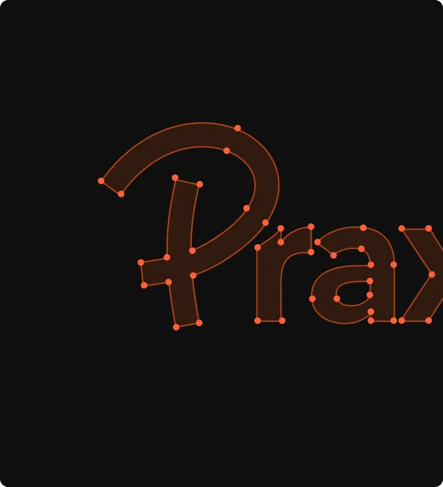
The logo felt generic, and the website was hard to read on small phones.
- No distinctive logo or visual identity
- Weak trust with new clients, who need a calm, professional first impression online
- Poor mobile experience, no guideline for consistent brand use
Solution
To bring all our ideas to life and keep our whole team working toward one goal, we planned a clear, step-by-step workflow covering the logo, brand guideline and responsive website. After accepting the project from the client, we:

Research Concepts
Gave a rough estimate, researched the brand, created concepts
Design Approval
Designed the logo, guideline and website, then got final approval
Testing Release
Tested screens on all devices, released to production, tested live
Our process
Since a brand must feel the same everywhere, our process focused on aligning identity, design system and responsive layouts from day one.
01 · Discovery & brand research
We spoke with PraxisMind’s team about their clients, values and goals, then studied similar practices. This gave us a clear picture of the audience, the tone and what the brand needed to say.
02 · Logo & brand guideline
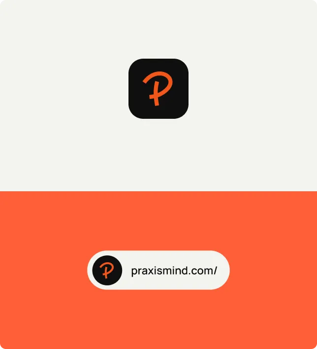
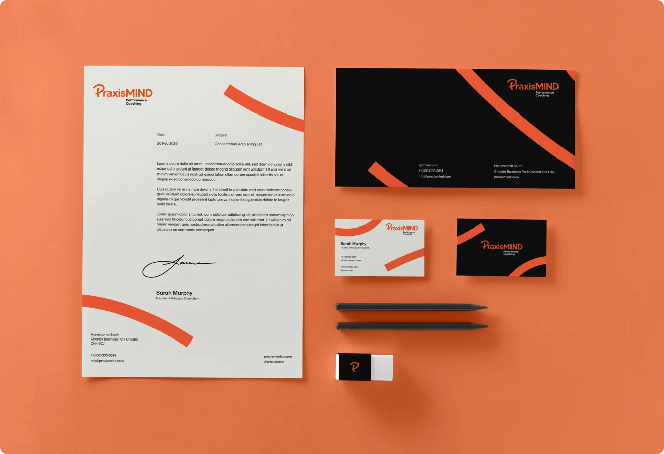
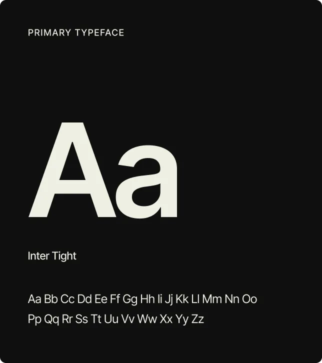
We created the logo and a brand guideline covering colour, type, spacing and tone, so every page, document and screen always looks like one brand.
- Logo versions for web and print
- Colour, type and spacing rules
- Tone of voice notes
03 · Responsive website design
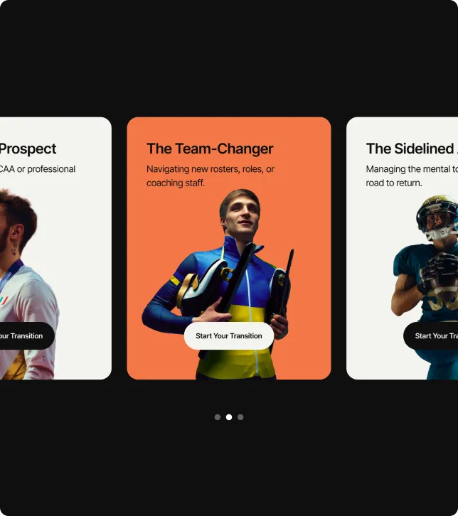
Each page was designed mobile-first, then expanded for tablet and desktop. Menus, buttons and forms were sized for thumbs and checked at all common screen widths, so the site stays easy to read and use everywhere.
04 · Review, testing & handover
We tested pages on different devices, fixed layout issues, and handed over the logo files, brand guideline and website designs in an organised package for a smooth build.

Our approach
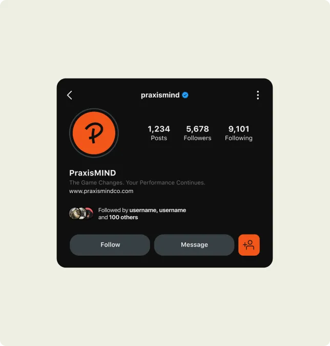
We kept the identity simple and calm, using clear shapes, soft colours and plain language so PraxisMind feels warm and professional.
Our approach focused on turning a practice into one clear, consistent brand across the logo, brand guideline and website.
Team
A brand designer, a UI/UX designer and a project manager from Appcrux worked closely with the PraxisMind team through discovery, design, review and handover, sharing regular updates at every stage of the project.
Technologies
The tools were chosen to keep the brand and website consistent, scalable and responsive across phones, tablets and large desktops.






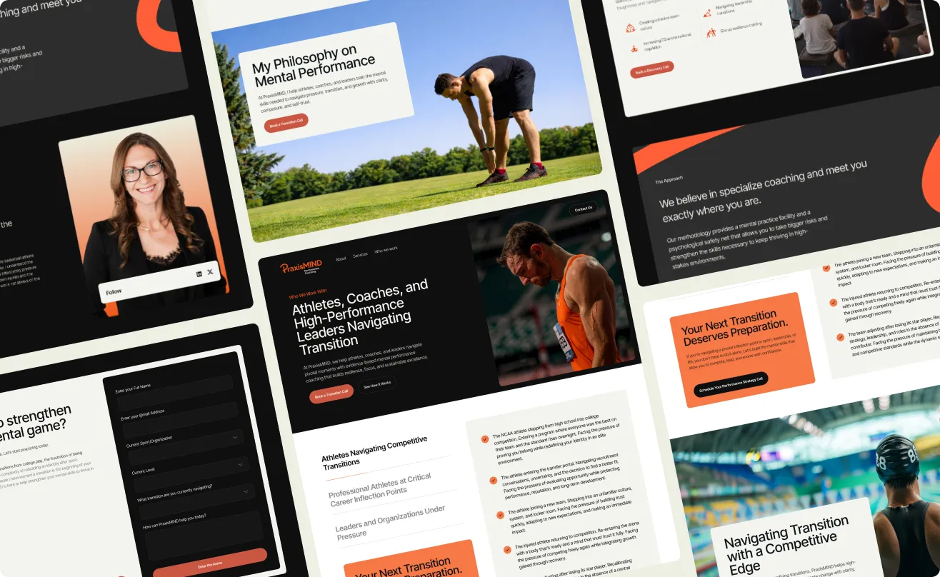

Appcrux gave us a logo, brand guideline and website that feel calm and professional. Their team was very responsive, clear, and well organised, and our new site now works smoothly on any device.

Robin Fish
Founder & CEO, PraxisMind
Recent client and Appcrux wins
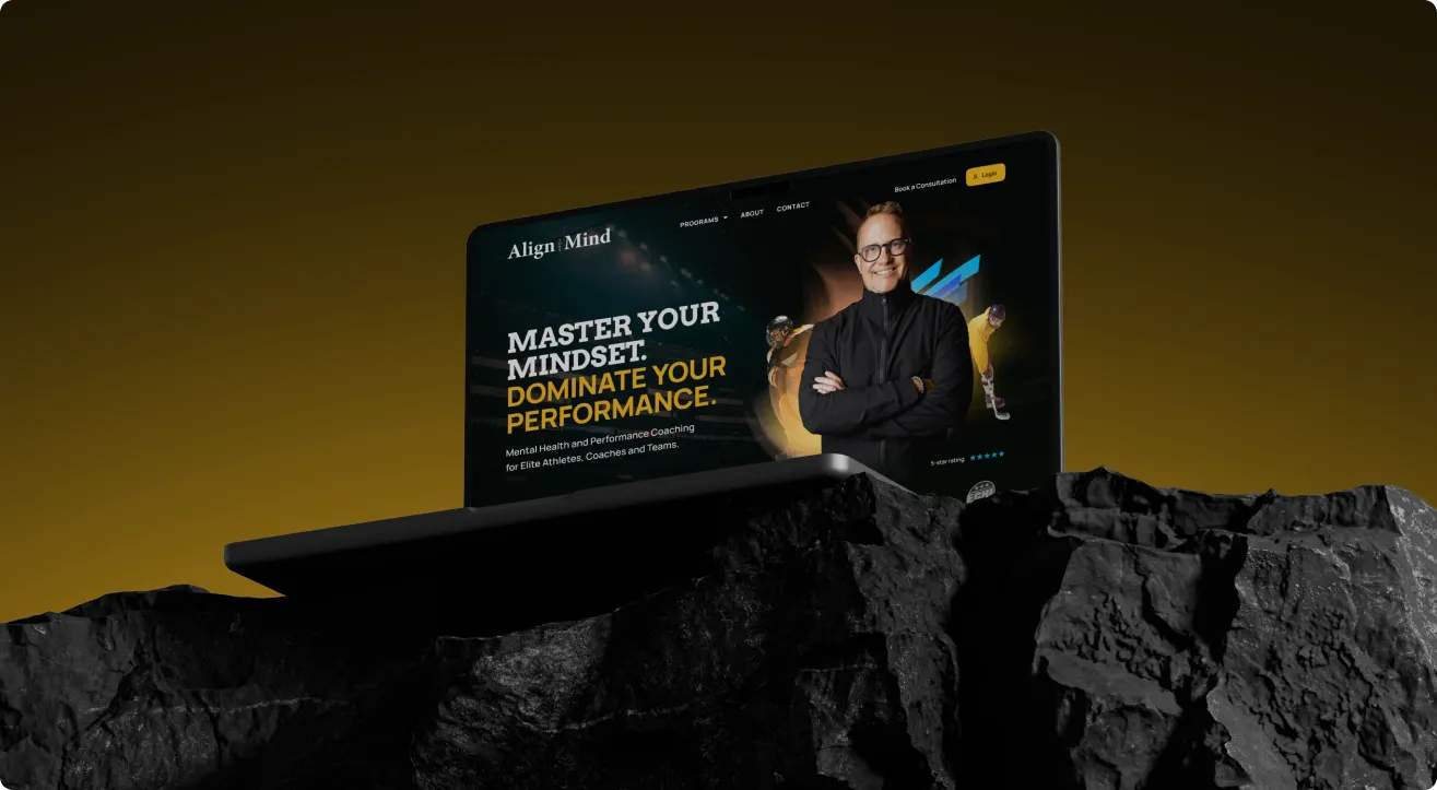
Align Your Mind
Align Your Mind
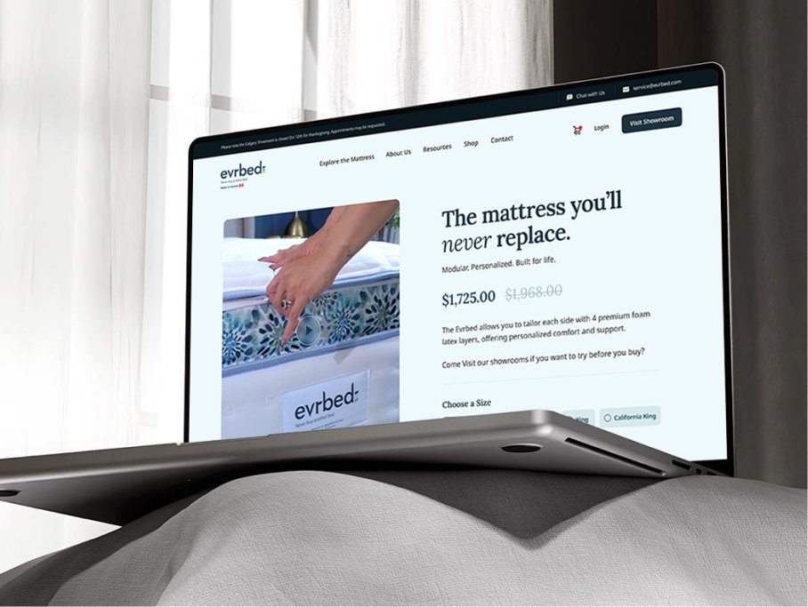
evrbed
evrbed
Ready To Transform Your Business?
Get started and scale fast with the appcrux for your businesses in any industry. we help in built website,marketing, design, SEO, App development, and e-commerce platform.
Send us an email at:
info@appcrux.com